


Case study · 2026
 Website redesign
The Digital Workplace, reimagined.
An editorial, people-first redesign of The Digital Workplace homepage, built to make podcasts, ideas and tools from top digital leaders easier to discover.


01 · Overview
Great content deserves a great home.
The client
The Digital Workplace publishes podcasts, articles and tools for leaders rethinking how teams collaborate, meet and work. Its audience is senior and curious, and expects an experience as considered as the conversations it hosts.
The brief
Redesign the homepage so it feels editorial, modern and easy to explore. Put the leaders and ideas behind the content front and centre, and make the next step obvious, whether that is a podcast, a topic or the Digital Workplace Score quiz.


02 · Goals
Three ideas guided every decision.

Editorial, not corporate
A publication-style type system pairing Inter with an italic serif accent, generous space and a confident dark palette.
People first
Real leaders, shown big and in black and white, so the faces behind the ideas become the hero of the page.
An obvious next step
Clear paths to listen, explore a topic or take the quiz, with one primary action per section.

03 · Design system
A system built to scale.
Every element was defined once and reused across the page: a dark palette led by a single Magenta accent, an editorial type pairing, glass surfaces and pill-shaped controls. The full system is documented in a 12-page brand guidelines deck.


04 · The page, section by section
From first scroll to subscribe.
The hero
A headline with a point of view.
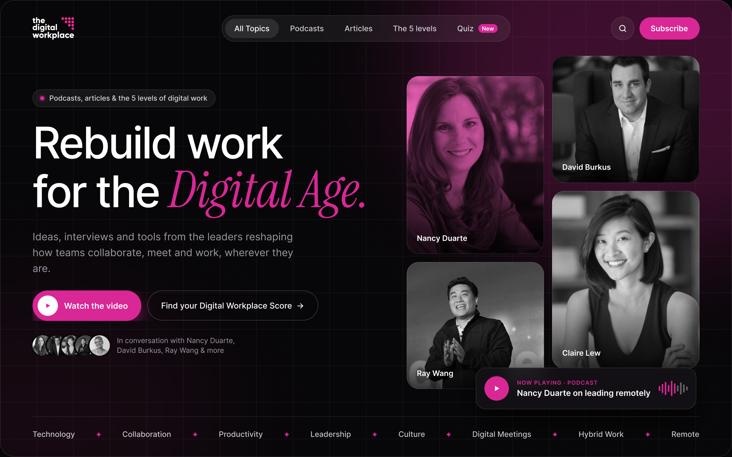
The hero pairs a bold Inter headline with an italic serif accent, frames real leaders in a portrait mosaic and surfaces the latest podcast in a floating player.
The quiz
Turning a quiz into a product moment.
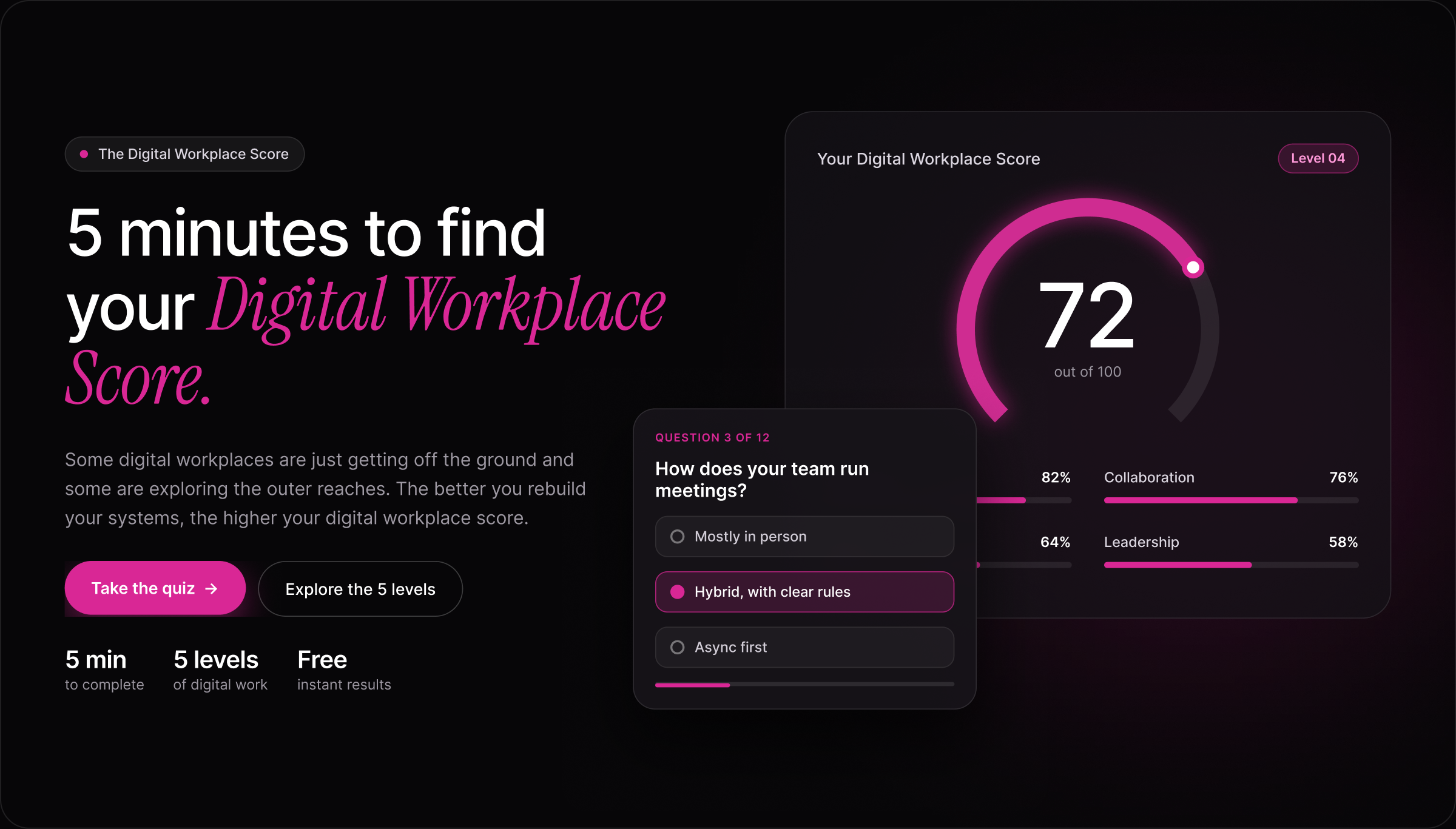
A live score dashboard previews the result before anyone starts, with a sample question that shows exactly what the quiz feels like.
The topics
Nine topics, one clear entry point.
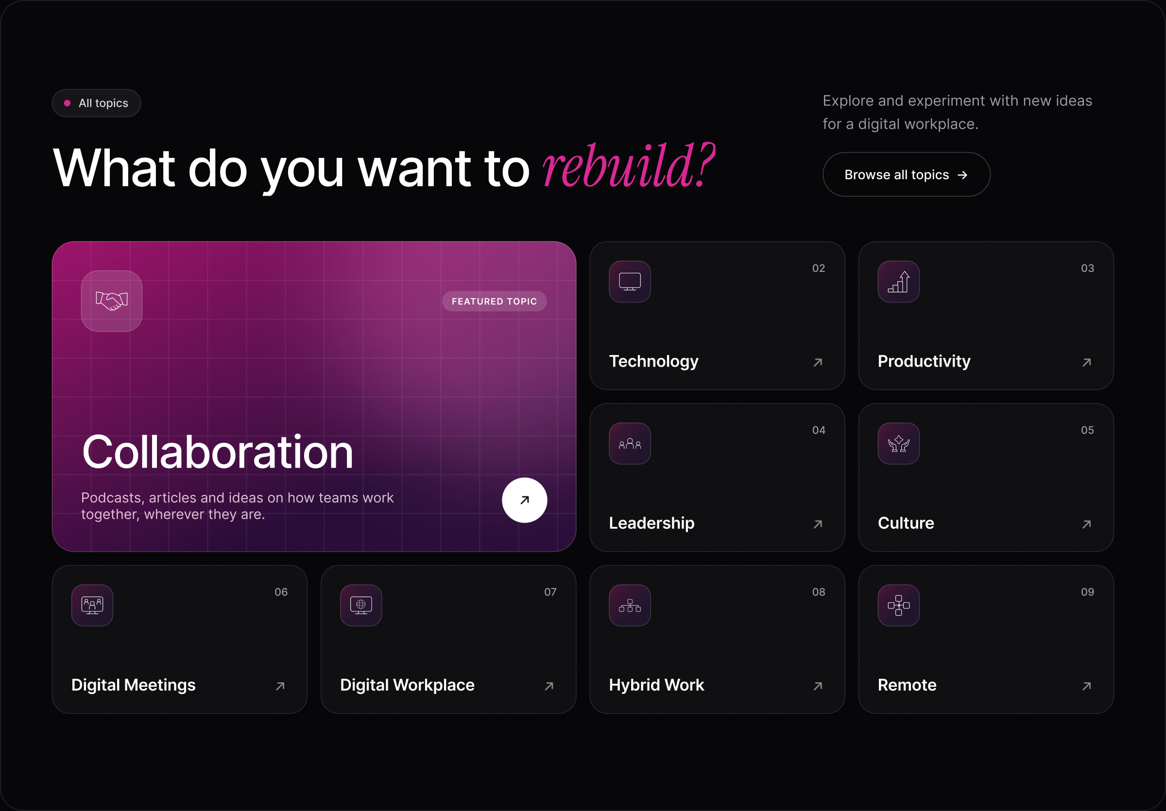
A bento grid gives Collaboration a featured spot while every topic keeps its original icon inside a consistent gradient tile.
The leaders
Letting the leaders speak.
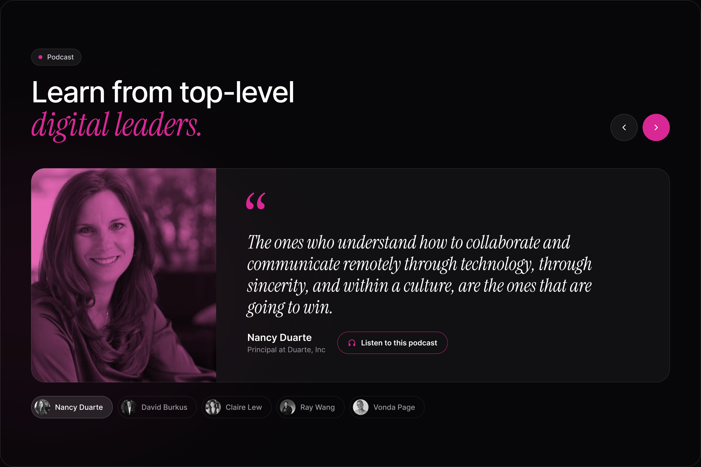
A large editorial quote card set in italic serif, with quick tabs to move between voices and a direct path to the podcast.
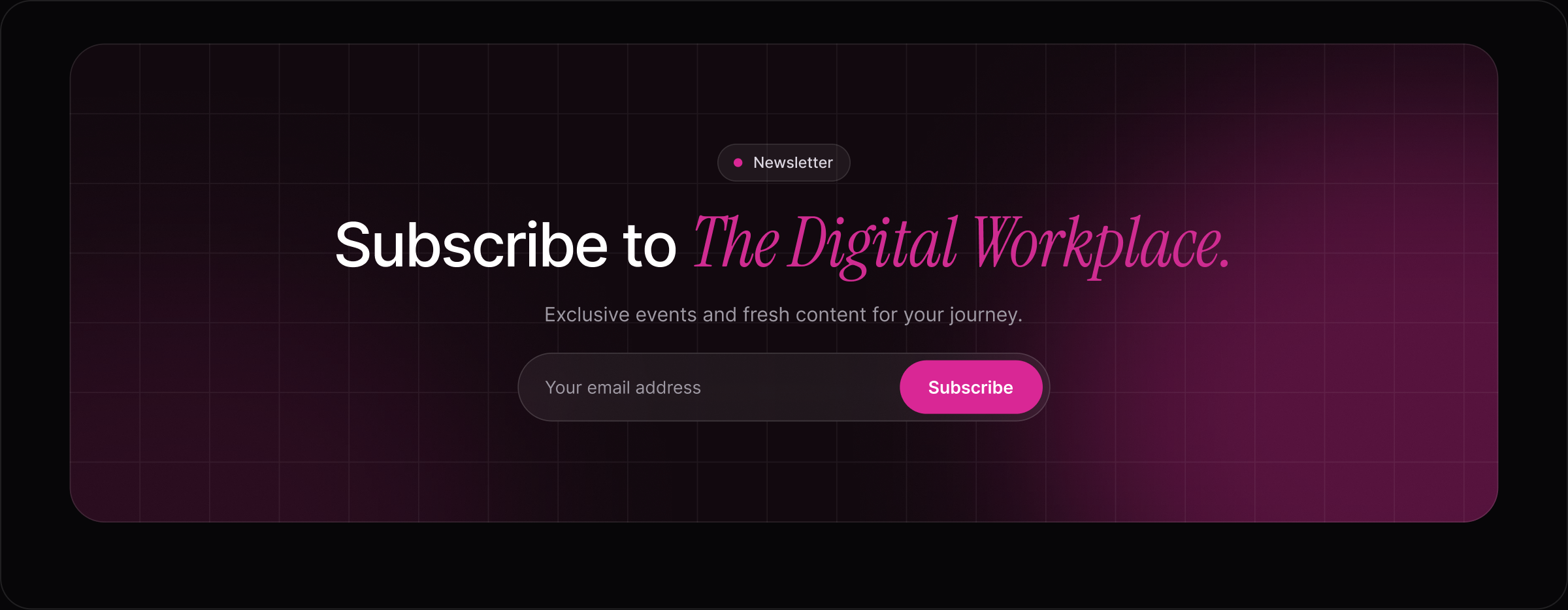
The newsletter
A closing moment worth acting on.
The page builds to a single glowing call to action, the one place the glow is allowed to be at its strongest.



05 · Mobile
Designed for the thumb.
Every section was rebuilt for a 390px screen: full-width buttons, stacked cards, a swipeable portrait row and a two-column topic grid that keeps the bento feel.


